

Dots, a Rainbow and a Lissajous: How Australia’s TV Networks Got Their Logos and Their Voices
Nine’s dots, Seven’s rainbow ring, Ten’s circle and the ABC’s Lissajous curve are some of the most recognised marks in Australia. A nostalgia thread ranking the five free-to-air networks sent us back through fifty years of logo changes, and to the announcers whose voices were as much a part of each brand as the artwork.
This weekend a thread in r/AustralianNostalgia asked people to rank Seven, Nine, Ten, the ABC and SBS at their peaks. The replies kept circling back to the branding. People quoted slogans from memory, argued over which logo belonged to which decade and remembered the channels by their old dial numbers.
Logos and station voices are the two things a network uses to say “you’re watching us” dozens of times a night. Here’s how each one got its look, and who some of the voices were.
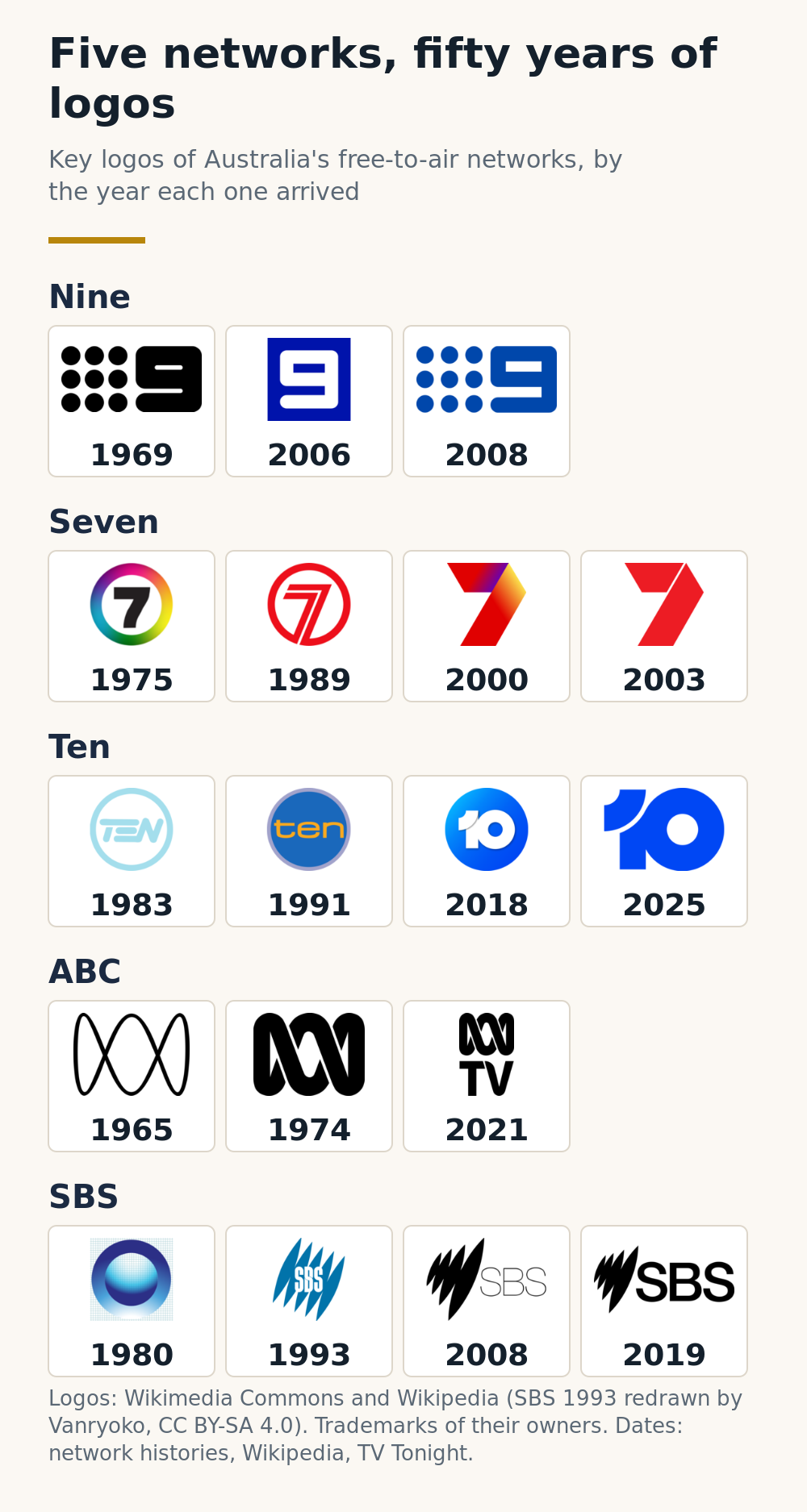
- Nine’s dots date to 1969. The network dropped them in 2006 and brought them back two years later.
- Seven’s rainbow ring arrived for colour television in 1975 and lasted until 1989.
- Ten kept a circle around its name for more than 40 years, then dropped it in 2025.
- The ABC’s Lissajous began as an oscilloscope pattern. The designer was paid £25.
- SBS’s “Mercator” splices stood for the five continents and the tilt of the Earth.
Nine lost its dots once, and learned its lesson
The Nine logo most Australians picture, a numeral beside nine dots in a three by three grid, goes back to 1969. Design history site Re:collection lists Channel Nine among the symbols by designer Brian Sadgrove that are still in use. The dots became shaded spheres in 1997, and Munich studio Velvet redesigned the whole on-air package for the arrival of digital television in 2001.
Then Nine did something networks rarely do. For its 50th anniversary in January 2006, it removed the dots altogether and put the numeral alone in a blue square. The change didn’t last. In January 2008, after David Gyngell returned as chief executive, the dots were fully restored under the slogan “we♥TV”, and they’ve stayed ever since.
Dots out
For the 50th anniversary, a plain blue square with the numeral and nothing else. It ran for two years.
Dots back
The grid returned under “we♥TV” and is still the network’s logo today.
Nine’s slogans stuck too. Replies to the thread included a simple “Still the One!”, the line Nine used in its long-running promotional campaigns.
Seven went from a rainbow to a ribbon to red
Seven’s stations became “Network 7” in October 1970, and, as Seven West Media’s own history puts it, a national network logo was born. The version older viewers remember best is the rainbow ring that arrived with colour television on 1 March 1975. One commenter, a regular Seven viewer, described “the rainbow circled logo from 1975 to 1989”, and the move to “Only The Best on 7”.
In January 1989 Seven switched to a red logo with the circle built into the numeral, launched alongside Home and Away. On 1 January 2000, ahead of the Sydney Olympics, it introduced the multicoloured ribbon seven. Since September 2003 the logo has been two solid red shapes forming a 7, which is what you’ll see on the AFL grand final coverage this weekend. Seven’s promotional line lives on in memory as well: “Man channel 7’s ad slogan “The one to watch” and Coldplay’s Beautiful World song for 10 are forever burnt into my head.”
Ten lived inside a circle for four decades
Ten adopted a neon-style circle with “TEN” inside it in 1983. From January 1991 it used a lowercase “ten” in a circle, and that ring went through four versions, turning yellow in 1999, glossy in 2007 and blue in 2013.
The first major rebrand in 27 years came in October 2018, when the name became a numeral in a circle, designed by agency Principals with Ten’s in-house team. “So much of this brand refresh project was about helping 10 find its mojo again,” Principals’ Simon Wright told B&T. Then chief executive Paul Anderson went further: “TV’s wild child has its voice back.”

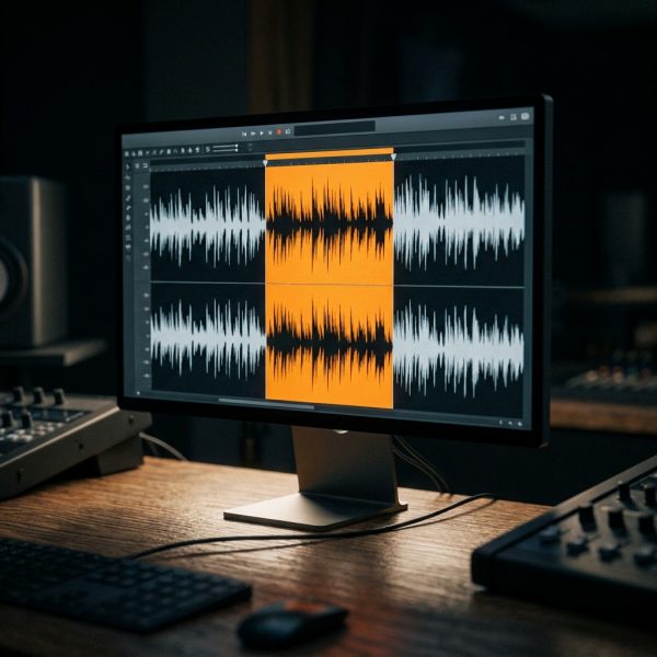
 VoiceEditSuiteRaw take in. Clean take out.
In June 2025, now under Paramount, 10 dropped the long-familiar circle and merged its streaming brand into a single “10”. Karen Song, Paramount Australia’s head of network design, told TV Tonight: “Really, it’s just streamlining, building on that equity that we already had, making sure that we’re modernised and future fit.” Not everyone has warmed to the bright blue. One commenter’s verdict on today’s channel: “10: burns my retinas”.
The ABC’s logo started as a test pattern
The ABC’s mark is the oldest still in use, and the strangest in origin. From 1956 the broadcaster ran Lissajous figures, the looping patterns an oscilloscope draws when engineers tune frequencies, as filler between programs. After a staff competition, senior graphic designer Bill Kennard’s version was adopted in the mid-1960s. According to Re:collection, the ABC paid £25 for it, and at the time it was hailed as “Crisp, functional and of its age.”
The line thickened and gained its over-and-under crossover for colour in 1974. When the main channel was renamed ABC1 in 2008, the logo stayed, and TV Tonight’s David Knox was relieved: “It could have been disastrous meddling with such a recognised logo”.
SBS drew a map of the world
SBS launched in October 1980 as Channel 0/28, with a globe in a ring, which is why so many viewers still call it channel 0. “I still think of them as Channel 0 and Channel 2 in my head, any one else do this?” one person asked.
In 1993 it introduced the “Mercator” logo, five curved splices for the continents, set at an angle for the tilt of the Earth’s axis. The 2008 refresh cut them to four, which SBS described as “an evolution of the original Mercator map representing the globe”. The current look, “A World of Difference”, arrived in 2019.
The voices behind the promos
Logos did the work on screen. On the soundtrack, each network had announcers whose voices told viewers what was on tonight, what was coming up after the break and when the Sunday movie started. Some of them became as recognisable as the artwork.
At Seven, John Deeks was often referred to as the Voice of Seven across 44 years, voicing promos for programs like Sunrise and the famous “come on down” on The Price is Right. In a 2018 interview quoted by TV Tonight, he described the job: “They can call me 24 hours a day, seven days a week. If someone passes away at 3:00 in the morning and they need to recut the Sunrise promo, you can call me, I will fix it.” He left the network in December 2020.
At Nine, Ken Sparkes was, in TV Tonight’s words, “The Voice of Channel Nine” for many years. Pete Smith joined GTV-9 in Melbourne in April 1964 and, as TV Tonight put it, has at various stages been the voice of the network, as well as the sound of Sale of the Century.
Max Rowley moved between all three commercial networks. His obituary lists him as Nine’s promotions voice-over announcer from 1975 to 1980, then Ten’s until 1982, and later the “Voice of the Seven Revolution”. In his own words, he spent the next half century “recording over 10,000 professional Voice over jobs.”
The ABC’s continuity announcers were a tradition that began on the first night of ABC TV in 1956. Tony Featherstone, once known as the Voice of ABC, was the last of the full-time announcers when he stepped away in 2011. And in the thread, one commenter reached for an ABC newsreader’s voice when ranking the channels: “Aunty (Come back James Dibble, all is forgiven)”.
Ten and SBS are harder to pin down. We couldn’t find a well documented long-running “voice of Ten” after Rowley’s stint in the early 1980s, and SBS’s on-air voices are rarely named in print. If you were one of them, or worked with them, Voice Over Herald would like to hear from you.
Why the old marks still land
Every network in the thread has rebranded several times, and yet the versions people remember are the ones they grew up with: dots, a rainbow, a circle, a waveform, a globe on channel 0. The voices work the same way. A network can change its artwork overnight, but the sound of its promos is how most viewers knew which channel they were on before they even looked up.
The full thread is on r/AustralianNostalgia.
Sources: r/AustralianNostalgia thread “At their individual peaks, how do you rank the big 5 OG FTA channels?” (September 2026); Re:collection biographies of Brian Sadgrove and Bill Kennard; Velvet Mediendesign; Seven West Media; B&T, 31 October 2018; TV Tonight, 26 January 2008, 11 April 2014, 12 September 2016, 2 February 2019, 17 December 2020, 5 May 2024 and 30 June 2025; SBS, 7 May 2008; Wikipedia histories of the Nine Network, Seven Network, Network 10, ABC TV and SBS. Logo images from Wikimedia Commons and Wikipedia; the 1993 SBS logo is redrawn by Vanryoko, CC BY-SA 4.0. All logos are trademarks of their owners. Reddit comments are quoted as written.
Lee este artículo en español: Puntos, un arcoíris y un Lissajous: así nacieron los logotipos y las voces de la televisión australiana
Know something about this story, or spotted an error? Tell the newsroom.